I am posting a link to the most recent revision of the MeridianScribesHB 2010 XLIV (A.S. XLIV) so that others (and myself) can find it later.
Palatino Ink
I’m making a new batch of ink for the Midwinter A&S entry. It is an oak gall ink recipe by Giovambattista Palatino (1515-1575, Italy) from Scribes and Sources by A.S. Osley, pg. 92-93.
The batch was started on Sunday. I cracked 1 1/2 ounces of oak galls and added them to 16 ounces of distilled water (substitute for rain water). Recipe calls for allowing them to “soak in the sun for a day or two.” Due to the inclement weather (massive, traffic stopping, school closing, low temperatures in the teens & twenties, highs below freezing ice storm), the ink was put in a glass canning jar in the window of the house that receives the most sun. The jar was left uncovered.
[The recipe called for steeping the galls “in half a flask of wine or, better still, of rainwater”. Image searches of period manuscripts depicted flasks about the size of a modern circular canteen. Search on modern canteens gave sizes of 32 – 85 ounces, with typical size of 32-45 ounces. As I do not need that much ink, I used the 32 ounce guestimate and cut the recipe in 1/2.]
Tuesday night, 1 ounce of copperas was added and the mixture was stirred with a fig stick.
Midwinter A&S project – post #2
New batch of ink started on Sunday based on the Palatino recipe from Scribes and Sources book. This is an oak gall ink recipe with a twist of stirring with a fig stick and adding pomegranate peel at the final stage.
Did the basic layout for all 7 plates and sketched out the illumination in pencil. Calligraphy and inking of illuminated areas on hold pending new batch of ink.
Prepped new batch of gesso based on Maitresse Yvianne de Castel d’Avignon, OL
AEthelmearc’s recipe (slaked plaster, hide glue, honey, Armenian bole, and water).
Midwinter A&S project
 Inspiration piece from “The Tale of the Panther of Love”. Paris, France. Early 15th century. Original is 290 x 210 mm [~11.5″ x 8.25″] (text, 195 x 130 mm, [~7.5″ x 5.125″). Published in “Western European Illuminated Manuscripts”, pg. 88-90.
Scroll will be created as 255 x 204 (10″ x 8″), (text, ) for ease of framing for the recipient.
Tools used for layout: framing matte, ruler, pencil, t-square
Calligraphy Tools/Materials: Pergamenata, Oak gall ink (mine from last year), quill, ames lettering guide. Line spacing approximately 5 mm high (setting of 9, double spaced). Text written midway between lines as in original. Lines drawn in pencil.
A Little Bit of Calligraphy
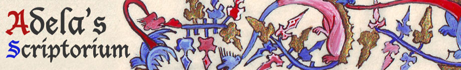
I did some scribing over the weekend at Kingdom A&S. I put the text in on one of Lady Isabella de Boyce’s illuminated pieces. It was a Sovereign’s Pleasure. It took about an hour to get it done. I used a quill and iron gall ink. The hand was textura quadrata. Will try to remember to post a picture if I can get a copy of it.
Holy Cow! (from back in April)
Not Holy but still Cow! Or more precisely, cow skin. Vellum or parchment depending on who you ask.
Back in April, I had done about 8 weekends in a row that I was either at an event or otherwise not at home. It was definitely time for a break. I was not going to another event until Lusty Month of May. I heard that Bryn Madoc was hosting an Iron Scribe at their Dreamstone event. It sounded so cool but I really needed a break so I was not going to go. I needed a break!
Then I heard that the prize for the Iron Scribe competition was going to be almost a full hide of vellum. A full hide of vellum!!!! I decided I could take a break the next weekend. 🙂
The rules for the contest were you had to start with a blank sheet of paper and end with an illuminated piece that was at least 5″ x 5″. The contest started at 10am and ended at 3pm.
I am a wee bit of a competitive person (wee b
eing probably a bit to the excessive side) and I really, really, really wanted the vellum. I did do a bit of pre-prep work: found a source piece, enlarged a photocopy to the proper size to get an 8″x10″ (5″x7″ illumination area) scroll, and made certain the text of a GOA would fit in the space.
The source piece is a late 14th or early 15th century French (Paris) Book of Hours. The original was 215 x 155 mm (text 110 x 72 mm) on Parchment. Page 74 of the book “Western European Illuminated Manuscripts.”
The design was traced on the paper (Pergamenata) using a light box and 01 technical pen. Calligraphy was done with .75 Brause nib using iron gall ink. Calligraphy style was textura quadrata.
I used gesso that I started re-hydrating the night before. The gesso is from the original batch I made years ago. (Ingredients: slaked plaster, hide glue, honey, Armenian bole, water) It turns out there was about twice as much gold to put on as I had originally thought when I looked at the picture. The gilding process took about an hour and a half longer than I had originally planned for.
I used gouache for the illumination. Holbein light ultramarine and alizarin crimson for the blue and red. The painting was finished at 4 hours and 57 minutes. Because of the extra time spent on the gold, I was not able to get the white work on during the contest.
This is what was done for the judging
I put the white work on during the 4th Wednesday scribal night meeting and have since turned the final product in to Their Majesties. Total time on the scroll – approximately 8 hours.

The final product
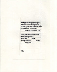
Golden Lily Scroll
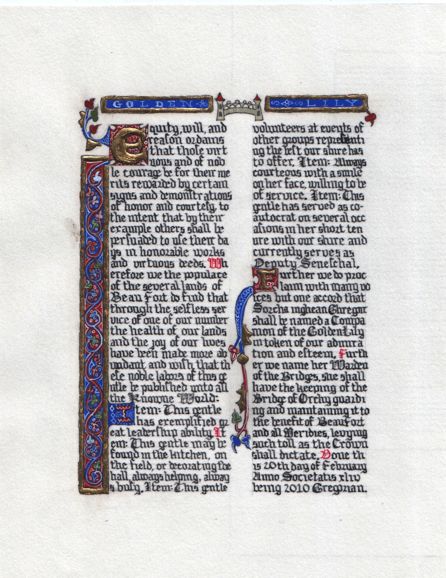
This was either my 6th or 8th Golden Lily scroll. That is why is it a good idea to scan the final product and keep a journal record so you don’t forget things like that.
I usually try to match this scroll to the person’s persona but, due to multiple obligations, I did not have time to find anything from the early Scottish period. Instead, I opted to go for something that I know I can do reasonably well without worrying too much about how it will turn out. This was not actually based on a specific piece – just more or less a stylized combination of 2 early 14th century books of hours shown the Pierpont Morgan Library “Painted Prayers” book. Essentially, red & blue bar with gold.
The piece was done on 8″x10″ pergamenata with the illuminated area being only 5″x7″. [Side note – when an 8×10 matte says it frames down to a 5×7 area, it lies. It actually frames down to 4 3/4 x 6 1/2 or so. Just something to keep in mind for next time.]
I originally intended to do the calligraphy with a 3/4 or 1/2 mm nib but picked up a 1 mm nib and didn’t realize it until I was several lines into the scroll. By that point, it had the look and size I wanted so I just went with it. For the ink, I used purchased iron gall ink. I was going to use the oak gall I made back at Christmas time but it seemed a bit too thick. I think I ended up adding too much gum arabic.
The gilding was done as raised gilding. See the previous post on the things learned in this session. The gilding was done in 4 1/2 hours. Outlining was done using 005 technical pen.
Gouache paints.
Gilding Lessons Learned Tonight
1. I prefer raised gilding to flat gilding. It is the super uber !WoW! effect that I love. Flat has a pretty color but it just doesn’t catch the light and give that special extra that the raised does.
2. When reconstituting gesso, it is better to add water and walk away for 5-10 minutes than trying to add a few drops and stir. The immediate stirring only gives you lumpy gesso that is very hard to work with. Patience is a virtue.
3. Get the right consistency (by following lesson #2) and you don’t have to do multiple layers. Much quicker to lay down AND easier to smooth after it has dried.
4. Raised is faster to do than flat. (At least when comparing the last 2 scrolls worked on – posts on those later this weekend.)
5. Raised used much, much less gold.
Ink
 I have made my first batch of ink! It is based on the recipe of Vespasiano Amphiareo, a 16th century priest as published in the book “Scribes and Sources Handbook of the Chancery Hand in the Sixteenth Century” by A.S. Osley which was my anniversary gift from Lorenzo.
The recipe calls for 30 ounces of strong white wine, 3 ounces of Istrian galls – broken not ground, 12 ounces of copperas (ferrous sulfate), and 1 ounce of gum-arabic, solid form. I ended up quartering the recipe due to the limited amount of ferrous sulfate I had. It came in a 100 g bottle which is only 3.5 ounces. I started this project on the 19th of December by putting the broken oak galls in the wine and letting it set for 12 days.
Tonight, I strained the liquid through a piece of linen and added the copperas. I ended up putting in all 3.5 ounces so it may end up a bit to the sludgy side, we’ll see. I forgot to order gum-arabic so I did a quick run by Michael’s for the liquid version. I ended up using 2 ounces of that. The residue on the inside of the jar has a dark purple hue to it.
The ink is supposed to sit for another 15 to 20 days to be at its “best and blackest”. I don’t have that much patience – the initial test shows that it is going to be very, very black. It is much thinner than the Higgins Black Magic but it does work its own special magic. The test letters I did went on as an almost transparent gray and *poof* before my very eyes, it immediately started to blacken.
It looks like it made at least 10 ounces of ink. On the bright side, I have enough ink to last a year or so. On the down side, I have enough ink to last for a year. (I’m already ready to make some more!)
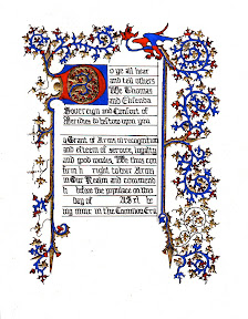
Res Equus
 So, this is a bit after the fact but just to document before I totally forget everything:
The good people of the Shire of Tir Briste hosted a scriptorium at their event. To encourage the scribal arts, scroll painting counted as points to the competing Romans and Barbarians. Partially painted pre-prints were worth 1 point, completed pre-prints were worth 2, and a completed original was worth 6 (I think they just made that up for me) 🙂
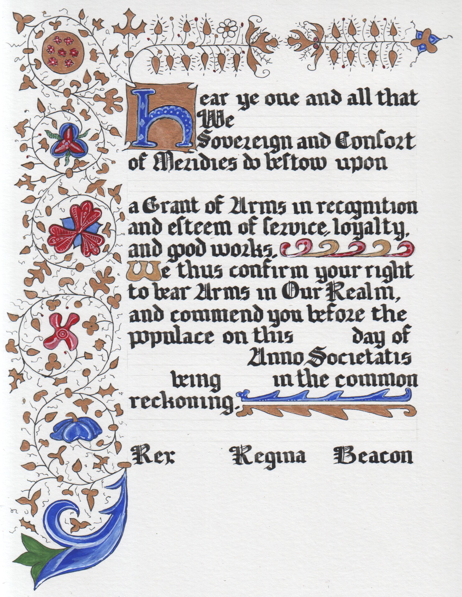
Since I was sans children, I had pretty much the entire day to sit under the pavillion and work on a Grant of Arms. I went with a 15th century Flemish type border – doodles were based on a Cathrine of Cleves folio. Gothic textura text was done with a steel nib (1.5 mm because the 1 mm turned out to be way too small for the text space) and the ink from the penner (omas). Illumination and gold were all done with Winsor Newton gouache. The final size was 8″x10″ illuminated area on an 11″x14″ sheet of bristol board.
Probably one of the coolest things about it is that I got to be there when it was given out and knew who the recipient was (Guillame de Pyrenes).